

Overview
Every course, quiz, SCORM package, Journey, and survey in Juno has a dedicated analytics view — a multi-tab dashboard showing learner progress, scores, completion rates, and more.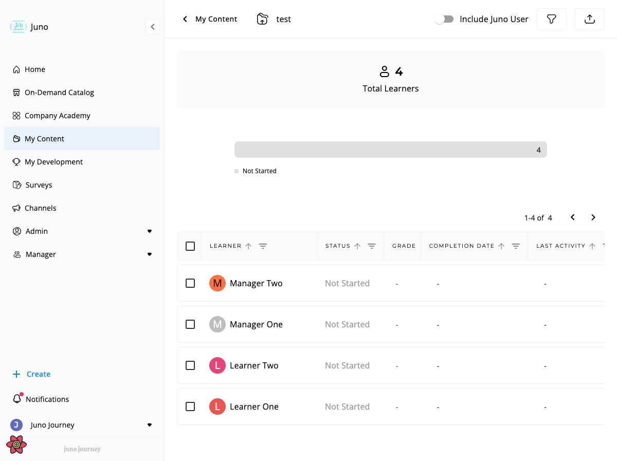
How to access
- From the unit editor — click the Analytics icon in the sidebar
- From Admin → Content — navigate to Learning Management, click a unit, then open the Analytics tab
- Managers see the same analytics views scoped to their direct reports
Analytics tabs
Which tabs appear depends on the content type:
* If the course has questions.
** If the content has signature questions.
*** If the content has open questions with assigned validators.
† Only when Insight Dashboards is enabled for your organization.
‡ Called Summary for surveys.
Learners tab
The main analytics view. Shows an overview bar, KPI cards, and a detailed learner table.KPI cards
† Only when the unit is inside a Journey that has review data.
‡ Requires the due-date feature to be enabled and at least one learner with an expired due date.
Status breakdown bar
A stacked bar shows how learners are distributed across statuses. Click any segment to filter the table to that status.Learner table columns
* Only visible when grade reveal is set to “Let me choose when to send results.”
** Only for Feedback and Engagement survey types.
Table filters
* User filter is disabled for anonymous surveys.
How Time Spent is measured
The Time Spent column counts active engagement with content — not just the time the tab was open.Same mechanism for courses, quizzes, and journey steps
The same tracking runs for every consumable unit type — courses, quizzes, SCORM (engagement portion), blog posts, journey steps. There is no quiz-specific tracker. The only difference between unit types is how the unit is structured into sections (see Course vs. quiz windowing below).What gets counted
While a learner is on a content section, the browser sends a small “still here” event every 20 seconds. Each event represents 20 seconds of consumption attributed to that section, that user, and (when applicable) that path / consumption context. When the learner leaves a section (navigates away, closes the unit), any leftover time below the next 20-second tick is flushed in one final event — so a 47-second visit counts as 47 seconds, not 40.Course vs. quiz windowing
Tracking is per section, not per unit. Each time the learner lands on a new section, a fresh window starts.What does NOT get counted
60-minute section cap
A single section window caps at 60 minutes of tracked time. After that, the heartbeat keeps running but stops sending events — additional time is not counted. The window resets when:
Practical impact:
- Courses rarely hit the cap because each section is its own window.
- Quizzes with a long time limit (e.g. 90 or 120 minutes) and a single continuous question list can hit it. A learner who stays in a 90-min quiz will have Time Spent capped at ~60 min even with constant interaction. The quiz submission still works as expected — only the reported engagement is capped.
The cap exists as a safety net against runaway tabs (e.g. a tab left open for days). It is not a session timeout — nothing happens to the learner; only the analytics column stops accumulating.
Resuming after going idle
When the learner becomes idle, the heartbeat stops. As soon as they move the mouse, press a key, or tap the screen, the heartbeat resumes on the next 20-second boundary. No event is sent for the idle gap. This means a learner who opens a 45-minute course, takes a 30-minute call, and comes back will see their Time Spent reflect only the time they were actually interacting — not the full wall-clock duration.Time Spent vs. time limit
For quizzes with a time limit, the two are independent:
A learner can have Time Spent = 12 min on a quiz with a 60-min time limit if they were idle most of the attempt. Conversely, a learner with multiple attempts can have Time Spent > 60 min total even with a 60-min-per-attempt limit.
User attribute filters
Filter analytics by learner attributes:- Location, Department, Position, Job Title
- HR Business Partner, Role, Employee Type
- Groups, Company, Ancestors
Filter out inactive users
A toggle in the user attribute filters panel that hides deactivated and deleted users from the analytics view. Inactive users are people whose accounts were deactivated or deleted in User Management. When the toggle is on, the same scope is applied consistently across:- The Learners table and KPI cards
- The Steps table (Journey analytics)
- The user-attribute filter popover (so dropdown options only reflect active users)
- The export file generated from the toolbar
The toggle state persists per user across analytics pages until you change it.
New Learners table
The new Learners table keeps the overview bar and the bulk actions of the Learners tab and adds grouping, suggested views, more sortable columns, and columns for your custom attributes. Filters for user attributes move from the side panel into the column headers. Surveys keep the current table.Group learners
Grouping may not be enabled for your organization, even when the new table is. Select Group by in the toolbar and pick Department, Location, Manager, Job Title, Role, or Assigned By. If your organization defines custom user attributes, they are listed under Custom attributes. None returns the ungrouped table. A rail of groups appears beside the table. Each group shows its number of learners, how many are overdue, and a small split of completed, in progress, and not started.- Select a group to filter the table to it. Select it again, or All groups, to clear. Hold Ctrl (Cmd on Mac) and select to pick several groups.
- Use Find a group to search a long list. Learners with no value appear under Not set, and small groups are gathered into Other.
- Select Hide groups to give the table the full width, and Show groups to bring the rail back.
- In the table, each group starts with a header row, for example Sales · 24 learners · 3 overdue.
Suggested views
Next to All learners, tabs marked Suggested apply a ready-made filter and sort. They always use today’s date, and they leave your column choices as they are.
Open the tab’s menu and select Save as my view to keep a suggestion, or Hide suggestion to remove it. You can also create your own views, rename them, and duplicate them.
Columns and sorting
- Select any column header to sort. Every column sorts except Groups.
- Assigned At shows when the learner was assigned. Last activity stays empty until the learner has opened the content.
- Number of attempts appears for quizzes.
- The attribute columns start hidden. Open User Attributes to show, hide, search, and reorder them: Department, Location, Job Title, Role, Employee Type, Company, Manager, Manager Email, Email, User Status, Hire Date, Assigned By, and Assigned At. Select Reset to restore the defaults.
- Each custom attribute your organization defines is also a column, hidden until you show it, and has its own filter. You pick from a list of values, or, when an attribute has very many values, you type into Search value.
- Select Reset filters to clear every filter at once.
- The export follows the columns you have on screen, including attribute and custom attribute columns.
Refresh the data
Admins see a small chip that reads Updated and the time of the last refresh. Select it to refresh the analytics. It changes to Updating… with a running timer, a refresh can take a few minutes, and Juno confirms with Analytics refreshed. The chip is disabled for a short while after a refresh.Pinned dashboards
With Insight Dashboards enabled, a strip above the table shows a dashboard you pinned. When you open the table from a dashboard, a banner says where you came from. After a click on a unit dashboard chart, the banner offers Back to all learners.Sections view
Courses only.
Responses view
Courses with questions, quizzes, and surveys.
Click a question to see individual learner responses.
Steps view
Journeys only.
Learner flow
In the newer layout of the Steps tab, a Learner flow ribbon sits above the step list. Each band of the ribbon is a group of learners by status, and the ribbon thins out where learners stall. Hover a step to read its numbers.- Each status in the legend is a toggle. Select one to show only that group in the ribbon and the step list, and select it again to clear.
- Every step in the list shows its number, its title, a bar of learners by status, and how many have completed it, for example 4 of 12.
- The step where the most learners stall is marked with the number of learners lost there, for example −7 learners stall here.
- The ribbon needs at least two steps. Until learners are assigned it reads No learner activity yet.
Validation view
Appears when content has open questions with assigned validators.
Dashboards tab
Courses, events, quizzes, and Journeys can have a Dashboards tab. It holds dashboards you build from widgets such as completions over time, overdue learners, and on-time rate, for this one piece of learning. Admins, the creator, and co-editors can use it. See Insight Dashboards to build one, publish it, or pin it above the Learners table.Survey-specific features
Survey analytics has two tabs: Summary, with Total Responses, Number of questions, the Survey type (Anonymous or Open), and the learners table, and Responses, which goes question by question. Share Report gives another person read-only access to the survey analytics.Sentiment Analysis and Responses Analysis
Open-text questions get two extra views next to their answers.
Responses Analysis appears once Juno has grouped the answers into themes.
Anonymous respondents
When a survey has anonymous mode enabled:- User names display as “Anonymous User”
- Avatar photos are hidden
- User filter is disabled
- Respondent IDs are encrypted
Consumption context
For Feedback and Engagement survey types, the analytics view tracks what the survey was about — such as a specific course, event, or user. This appears as:- A Consumption Context column in the learner table
- A Context filter to narrow results by context
Respondent view
Unique to surveys. Select a respondent to see their full set of answers. For surveys with consumption context, you can filter respondents by the context they responded in.Who can open survey analytics
Which surveys appear in your analytics view depends on your role:Super Admin analytics access mirrors the surveys list — if you can see a survey in Surveys as a Super Admin, you can also open its analytics. Other admins still need to be the creator, a co-editor, or have the survey marked Available for Admins.
Version selector
When a course or quiz has multiple published versions, use the version selector to view analytics for a specific version or all versions combined.The version selector may not be enabled for your organization.
Exporting analytics data
Click the export icon in the learner table toolbar to generate an Excel/Sheets file containing:- Main sheet — learner data and question answers (for courses and quizzes)
- Dictionary sheet — column definitions and data descriptions
- SCORM interactions sheet — detailed SCORM interaction data (SCORM content only)
- Journey export — generates one sheet per step in the Journey
Manager vs. Admin scope
In the new Learners table, managers see only the custom attributes your admin has made visible to managers. Admins see all of them. Only admins see the refresh chip.